Driving engagement and conversion rates for in-app marketing offers
Role
Experience Design Intern
Timeline
June - Aug 2025
Team
UX , Product, and Research Teams

OVERVIEW
My Goal
Solve for "content fatigue" and "banner blindness" by redesigning the in-app marketing and messaging framework. I increased the visibility of key offers by creating a more intuitive, non-intrusive ways for users to discover relevant content.
My Impact
• Pioneered a new visual language for in-app messaging to solve for "banner blindness" and create more engaging product discovery moments.
• Validated innovative concepts by leading a 300-person usability study.
• Directly informed the 2026 product strategy by identifying high-performing interaction patterns.
*Final designs are hidden to respect my NDA. Click below for recruiter access.
View Full Case Study (NDA Protected)
RESEARCH
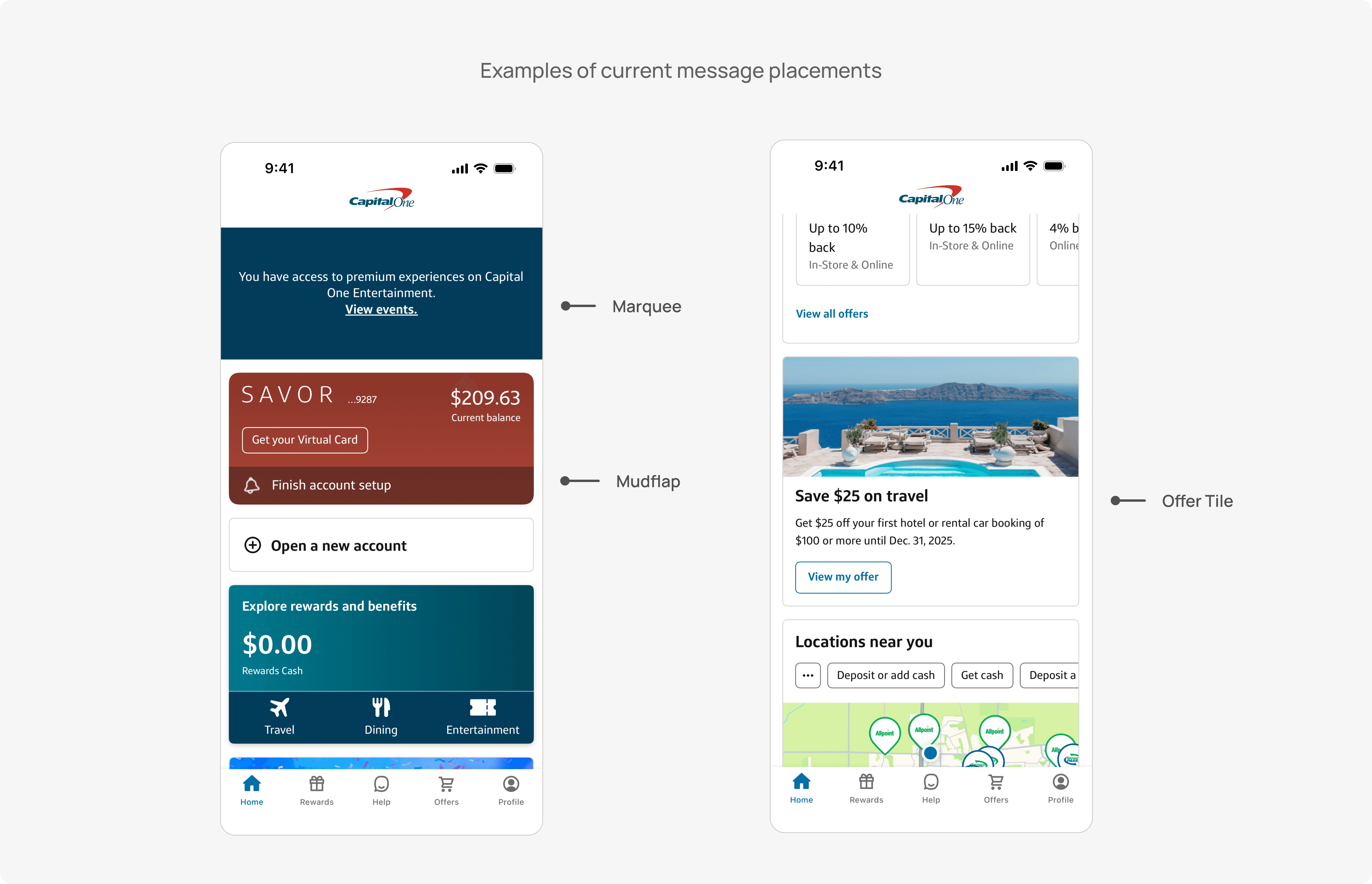
Current message placements struggle with banner blindness.
The modernization of the home page has made content consistent yet monotonous, and users have been so conditioned to the same content that they begin to just ignore it. This suggested an opportunity to explore new and impactful design strategies.
INSIGHTS
Message placements at the wrong moments hinder engagement and comprehension.
Customers already struggle to fully understand and utilize their offers, so determining the right moments and placements was key. I focused on optimizing marketing messages on the home screen and in critical user moments (e.g., after payments) to drive the most impactful improvements for our roadmap.
Based on competitive analysis and existing research, my key areas of focus involved both design and content strategy:
01 New layout and content varieties
02 Use of colors and highlights to draw attention
03 Utilizing tags as urgency indicators
04 Incorporating imagery and graphic elements
USABILITY TESTING
Users expressed their feelings and expectations towards offers depending on how and where they appeared in their journey
I conducted a total of 300 unmoderated usability tests with Capital One and non-Capital One customers with a goal to understand how users reacted to and felt about the new marketing message variants, and compare their sentiments to the current messages. Due to time constraints, I mainly focused on synthesizing the results from the end-of-task marketing message test.
REFLECTION
Learnings
01 Break down complex spaces with patterns
Diving into a space that had already been extensively researched made onboarding challenging. However, by taking time to connect with different teams, reviewing prior research, and building on those with my own findings, I was able to push the work forward and bring it to its next stage.
02 It's okay to pivot
In an ambiguous space with stakeholders from design, product, tech, and research, I learned how to handle shifting focus to align with evolving business needs. While my pivot in the beginning from servicing to marketing messages felt challenging at the time, it ultimately led to a stronger outcome and a successful final result.
03 Empower design decisions with system-wide level thinking
My strengths as a designer grew as I involved myself in cross-functional teams and processes. Understanding the broader ecosystem and how different products connect helped me strengthen my ability to make design decisions that were cohesive yet impactful at scale.

