Crafting rewarding experiences across Patreon's feed and emails
Role
Product Design Intern
Timeline
May 2026 - Aug 2026
Team
Design, Product, Engineering, Content teams

OVERVIEW
PROBLEM
An unlocked post shouldn’t look like any other free post.
Without a clear signal, fans might see it as standard free content. That missed perception of value means we lose the chance to convert interest into intent. So the question became…
How do we communicate value to earn more investment from fans?
Fans need to understand three things fast: this is normally paid, it was unlocked specifically for them, and free membership means more unlocks like it, enticing them to return.
SOLUTION
Consistent signaling across touchpoints turns unlocked posts into exclusive moments
I defined the unlock experience across mobile feed and responsive emails with cohesive visual, interaction, and messaging patterns, rolling out to ~6M users to test our hypothesis around repeat engagement and conversion.
DEFINE
Where is the line for being attention-grabbing and feeling gimmicky?
The current desktop experience utilizes space and color on a creator’s page to draw attention to it. In initial experiment results, this desktop shelf had already gotten positive signals towards increased DAU, so we knew this strategy was working.
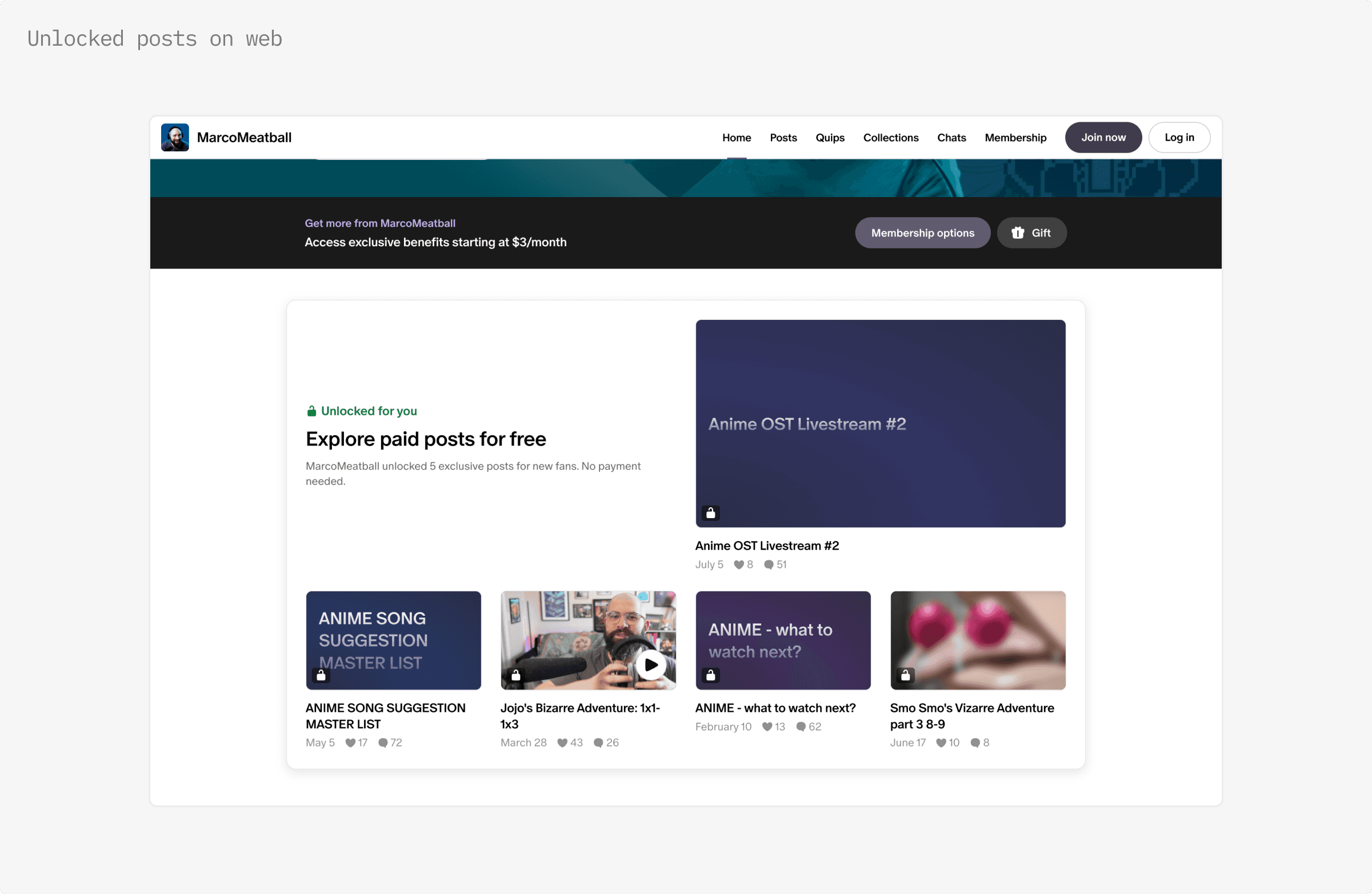
But while the desktop experience was showing success, on feed, fans are scrolling fast, space is tight, and the same experience couldn't just port over.
IDEATE
I prototyped fast to test and refine a real experience.
The team wanted to push this experiment out in 3 weeks, using Claude Design and Claude Code, I built working interactions, letting me test motion, new-user experiences, and hand-off polished prototypes to engineering.
Exploration 1: floating toast
Pro: A floating toast offers subtle motion and a space for additional context when a fan clicks on a post.
Con: This solution required more engineering efforts and was more risky given limited vertical space especially on smaller potential devices.
Exploration 2: tap to unlock
Pro: Providing a louder unlock moment on the feed as the first-time experience is more attention-grabbing and provides a sense of gamification and exclusive possession.
Con: Internal testing showed that the tap to unlock took away from the evergreen “Free for you” tag, and some felt they would be accustomed to looking for this pattern in future posts when it is only intended as a first-time experience.
Exploration 3: tooltip
Pro: We could use a tooltip as an in-line home for additional context that would appear the first time the user encounters an unlocked post.
Con: The tooltip would un-ideally require content to be pushed down and would potentially be content overload for a fan at this moment.
DESIGN DECISIONS
Nailing the motif before launch
To ensure we were putting out best foot forward, I also recognized areas where we could offer more visual clarity across the system.
Where and how do we present the "recsplanation"?
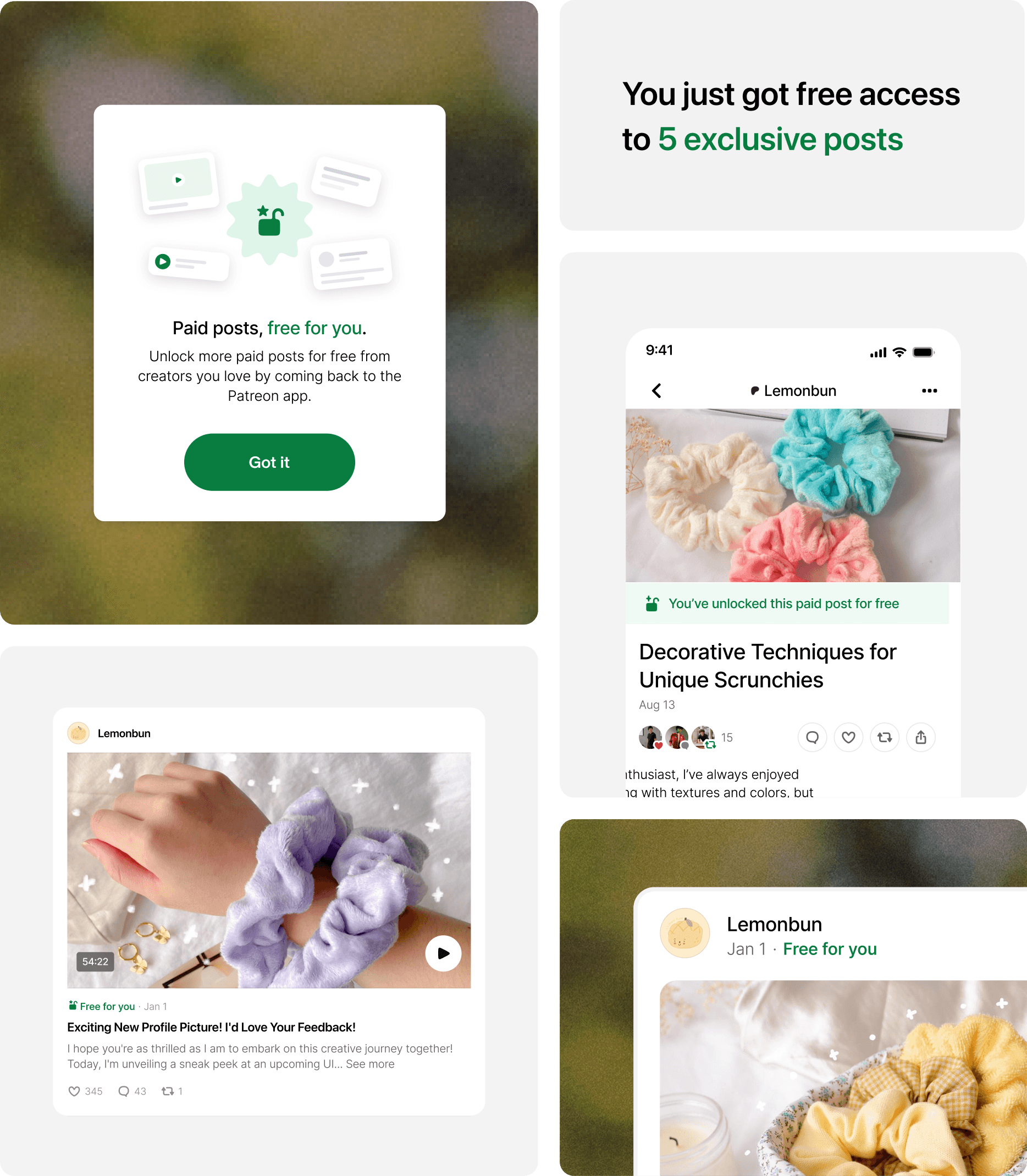
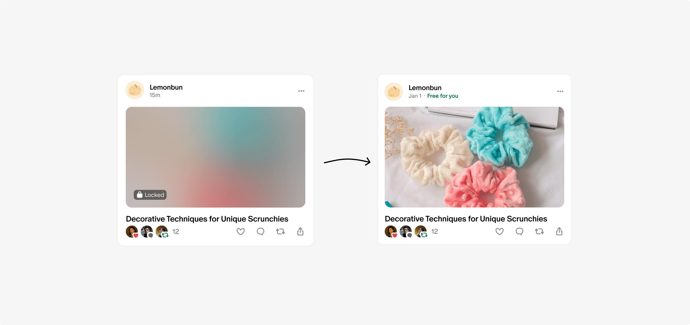
A recsplanation is usually a tag that explains something showed up on your feed i.e "Because you liked art". My internal testing revealed that "Unlocked for you" was ambiguous, leaving users unsure if a post was actually free or not. I tested leading with "Free for you" instead, which was significantly clearer. So I moved a fuller explanation to the post page itself. This gives users a low-friction signal in the feed and full context once they clicked in.

Do sparkles signify AI?
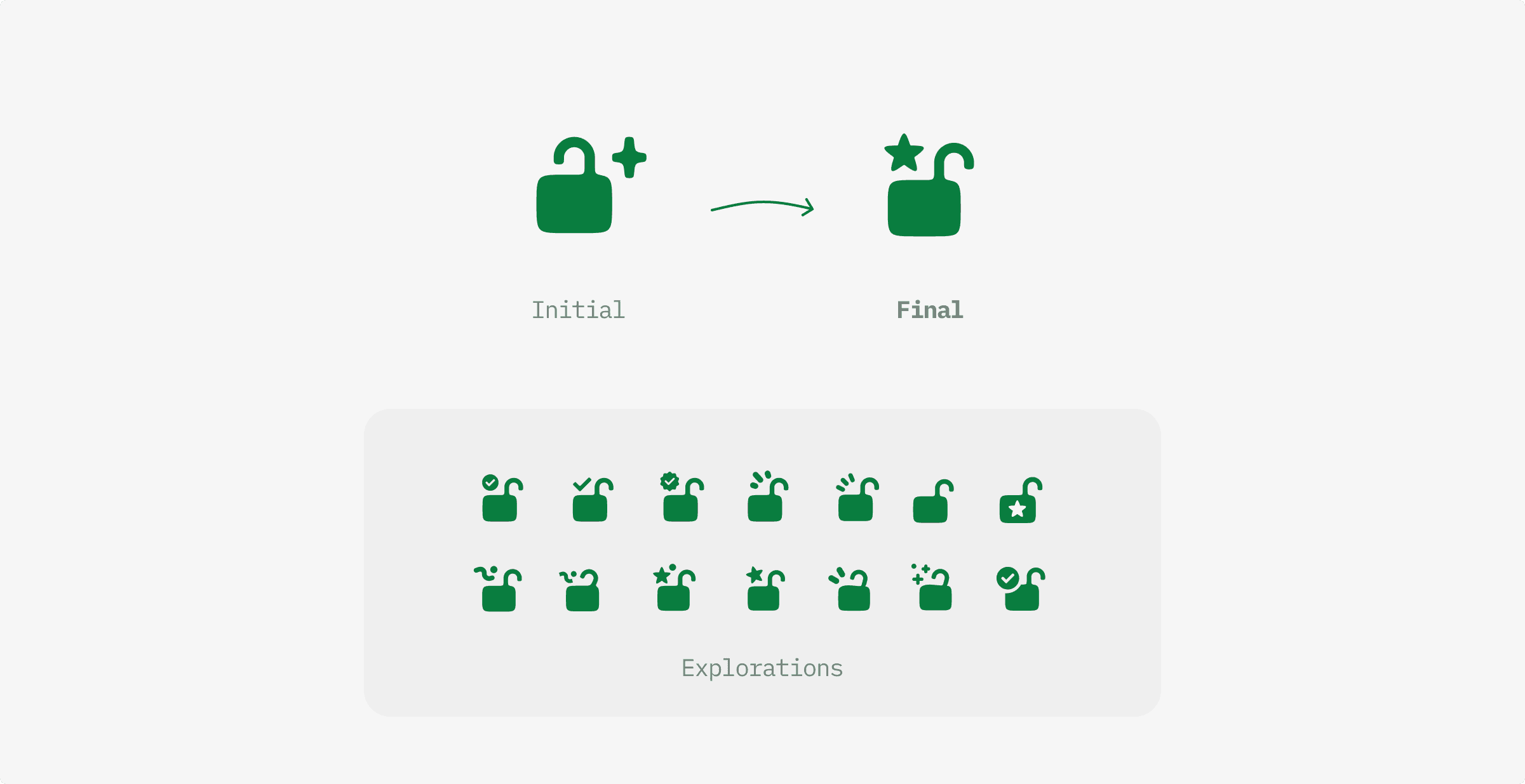
To avoid the risk of communicating something was ai when it wasn’t, I changed the sparkle icon to a star, following our symbolism for membership.
SOLUTION
Winning design: Modal as a new-user experience
Given density concerns on feed, this led me to believe that the value-proposition moment we were seeking should happen on the post page, not the feed.
We should lead with “free” on feed, and then once a fan clicks into the post, signal its value with a modal, offering delight not interruption.
EXTENDING CROSS-PLATFORM
What about the email entry point?
Some users will also receive free posts via an email. After establishing the system on the feed, I brought that consistency to email.

Multi-post email
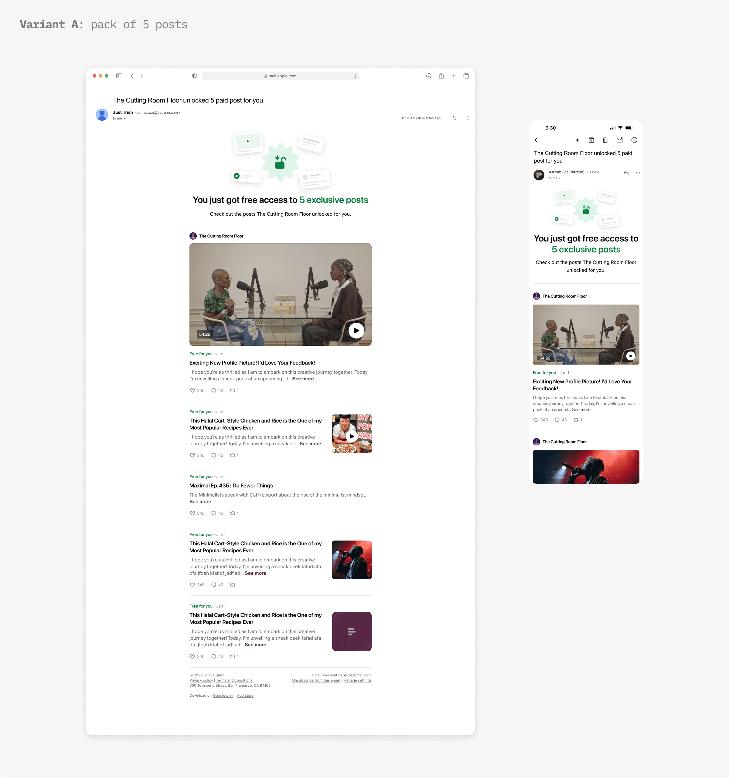
"Variant A" of this experiment optimizes the layout to showcase all 5 posts at once. I established new email patterns for showing posts in both a featured, and list format to create a feed-like familiarity while not making the web email too long.
Single post email
"Variant B" of this experiment sends one post in a drip-style overtime, so I designed a simplified version of the email header and considered lifecycle of the hooks to avoid them feeling repetitive, and spammy.
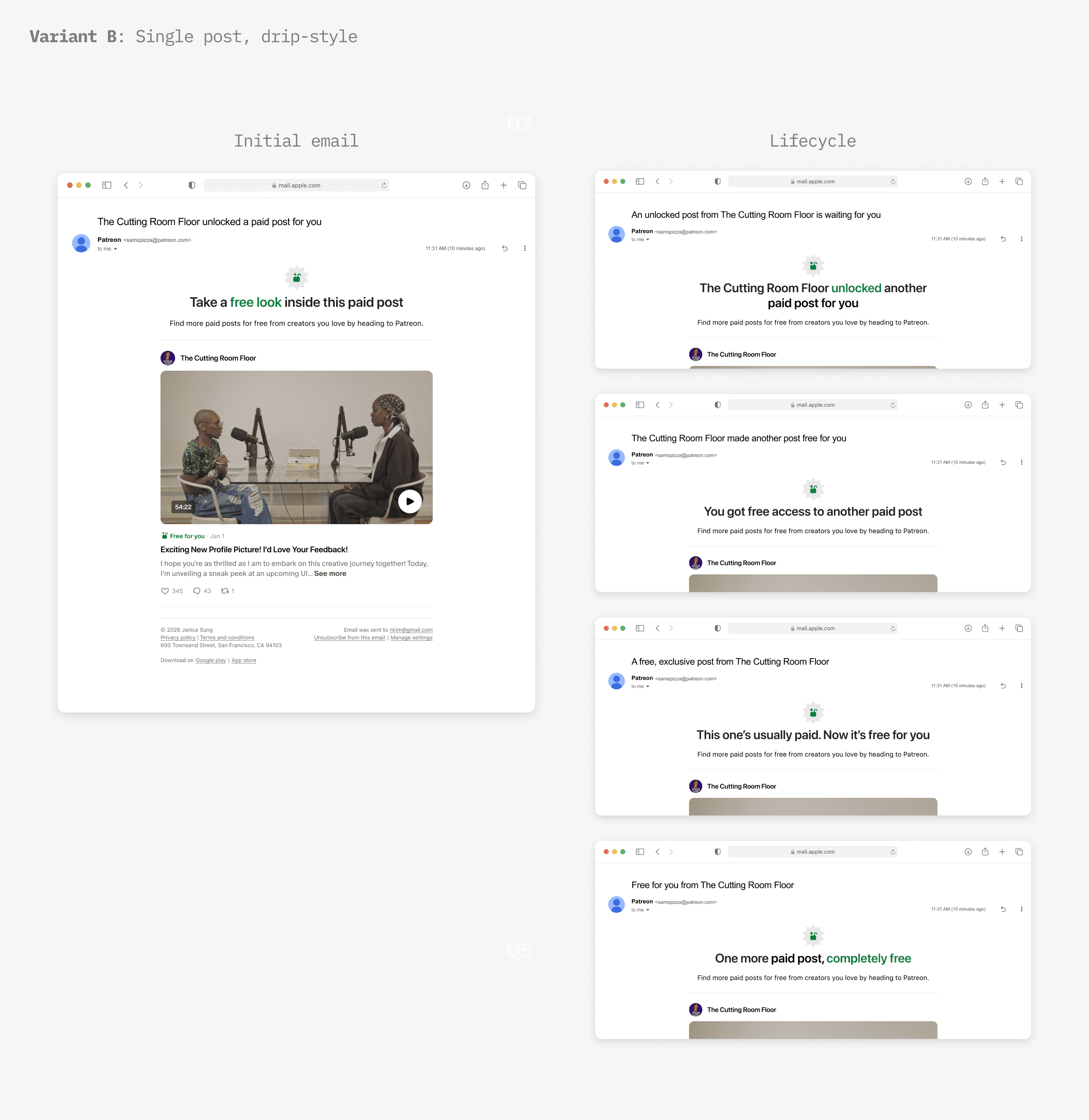
I worked with our third-party email tool team to ensure feasibility in these new patterns for showing posts and to build out initial mocks to hand-off for implementation with the backend.
FINAL FLOWS
A new way to discover unlocked posts
I shipped the the feed and email designs that covered 3 variants of the experiment.
REFLECTION
What I learned
Find ways to test conviction when the direction is ambiguous
With limited data, having a strong POV and finding lightweight ways to validate it (i.e internal user testing) before launch was how I uncovered hidden risks and moved our team to a consensus.
Good concepts can point toward what's next, even if they don't fit now
User testing showed the tap-to-unlock pattern was better suited to a mechanism I identified as a future opportunity, letting fans choose their own unlock instead of receiving one automatically. Rather than discarding the idea, I kept it in view as a direction worth building toward.
Bonus: I prototyped a lot this summer… check out my summer demo reel for a sneak peek!